Client
Eskelah Production & Digital Marketing
Date
2020
ROLE
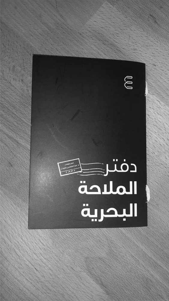
Brand Strategy, Brand Identity Design, Communication Tools and Brand Guidelines
Abstract
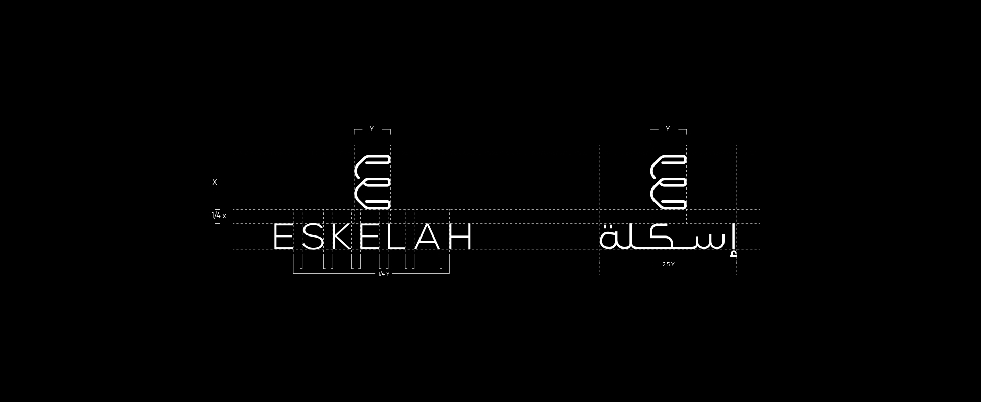
A Saudi-based digital marketing & media production agency, aspiring to be a business port for those who are seeking to settle in the KSA market. The word Eskelah is an Arabic word that translates to “The Ship’s Port” which helped us to build on and walk the same creative path this brand has walked before.

BACKGROUND
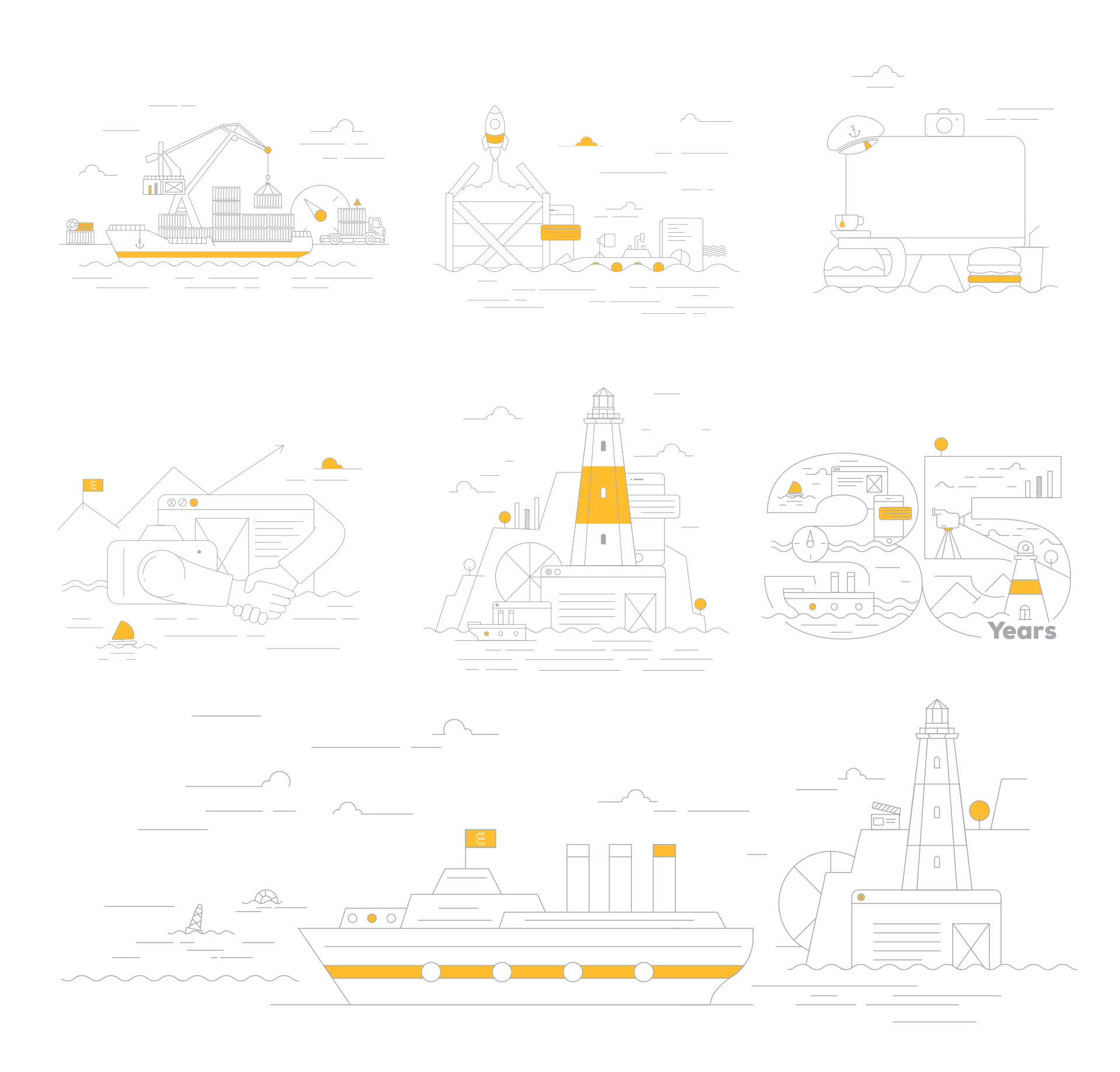
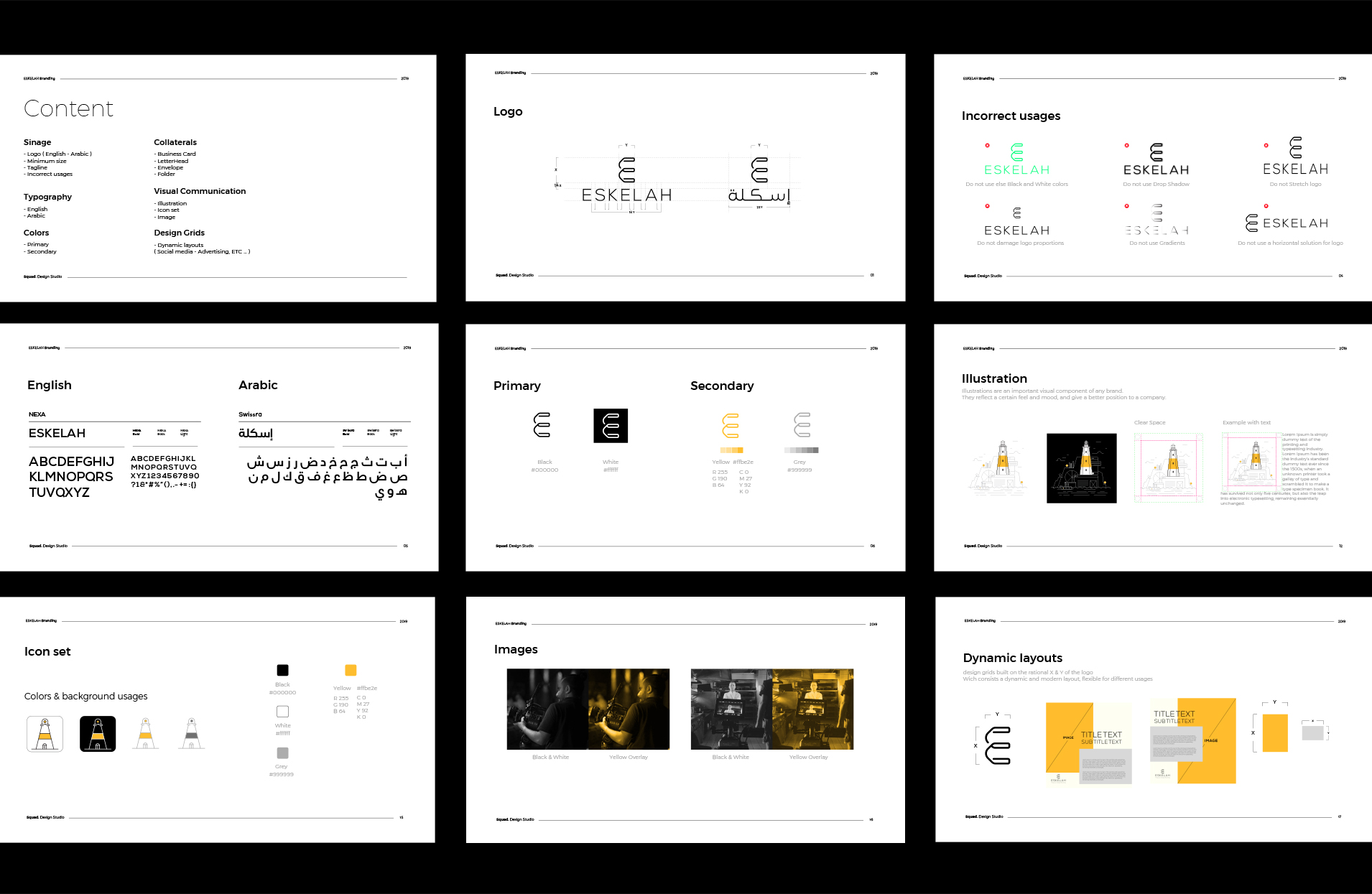
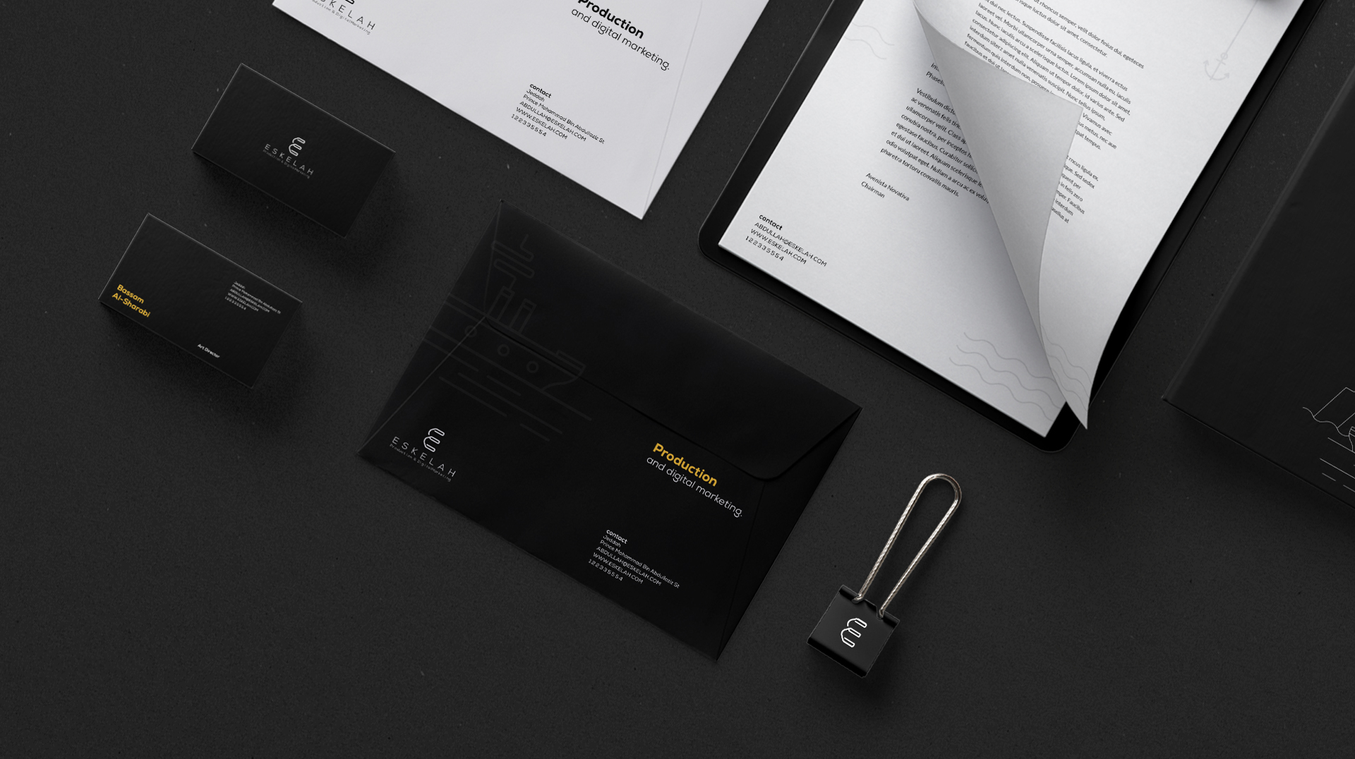
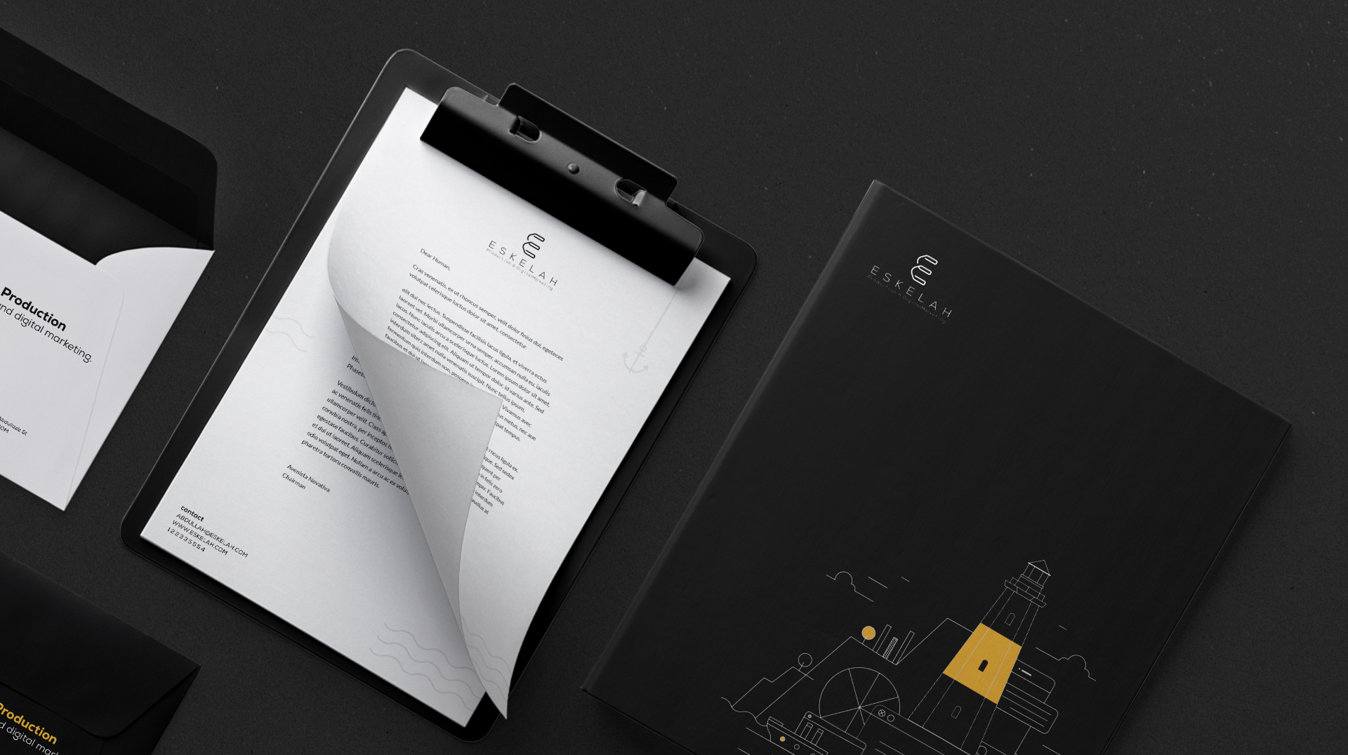
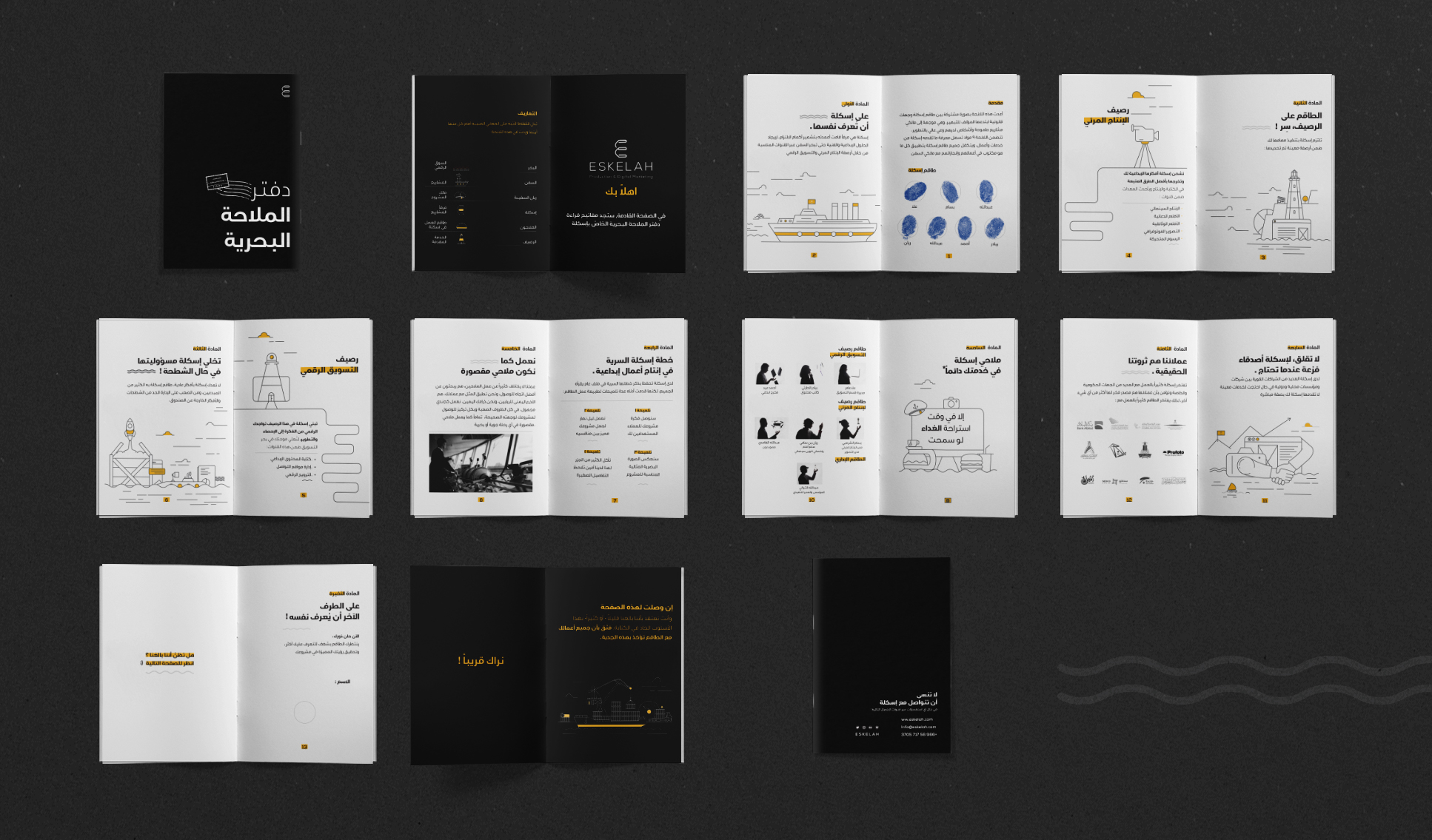
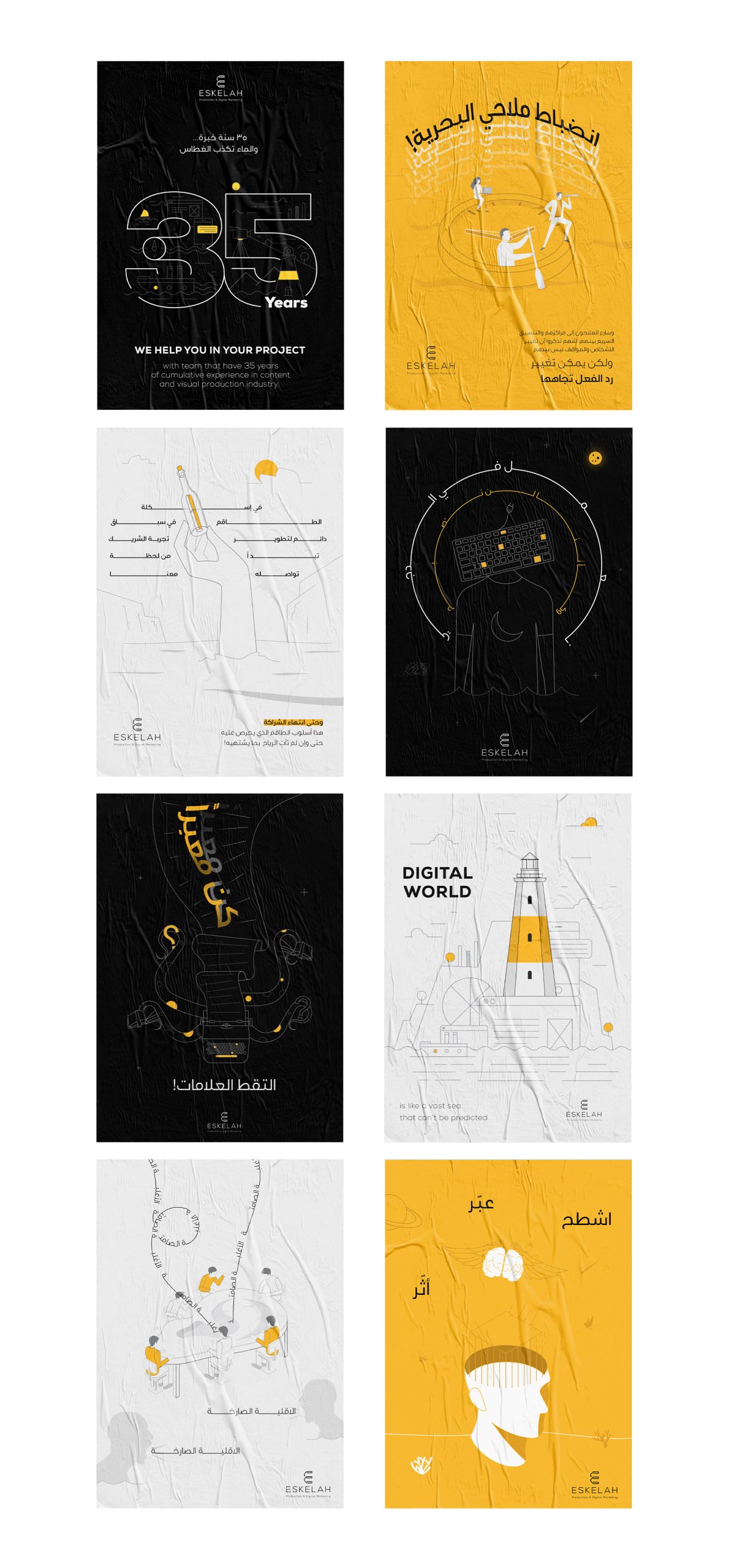
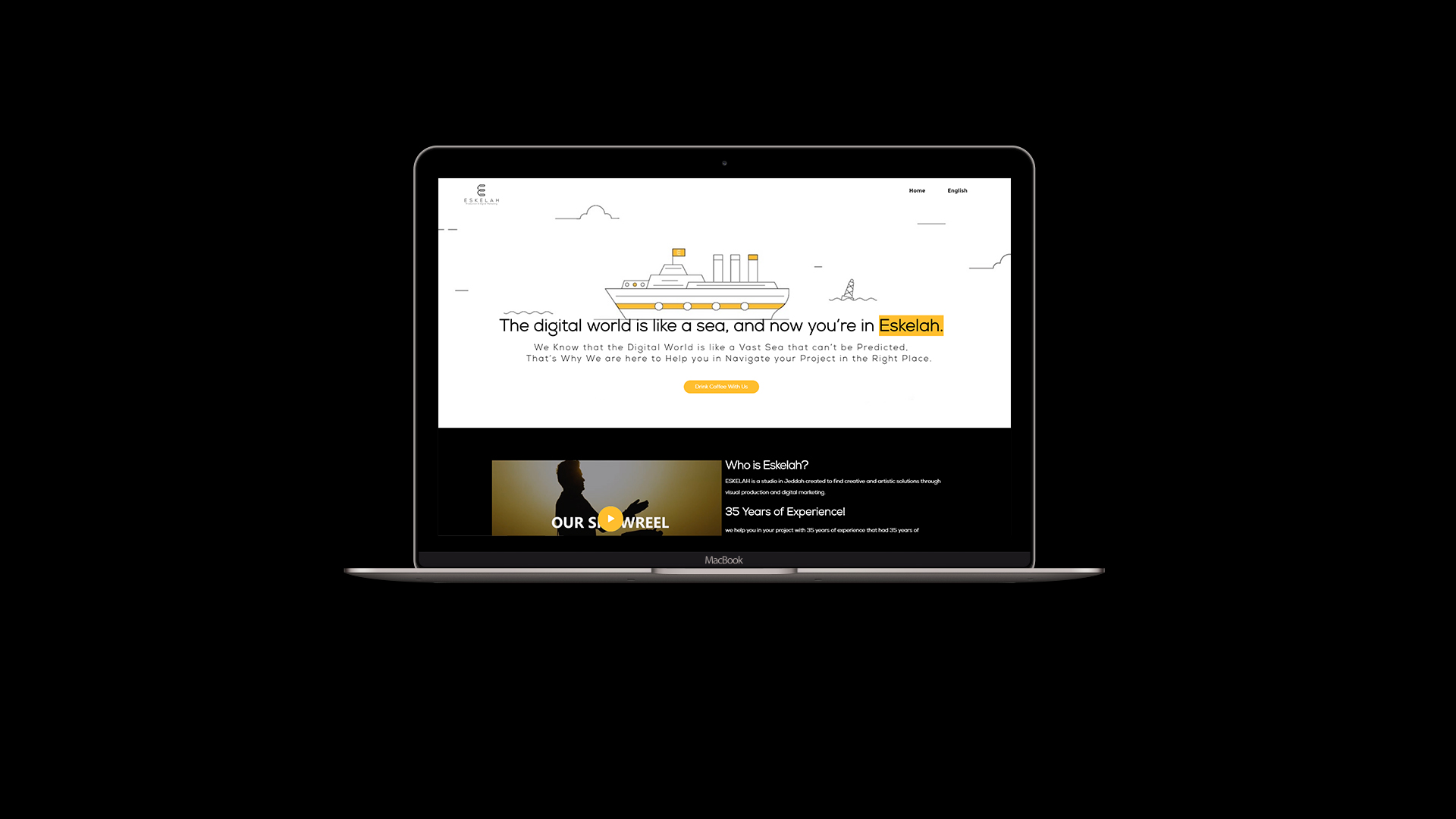
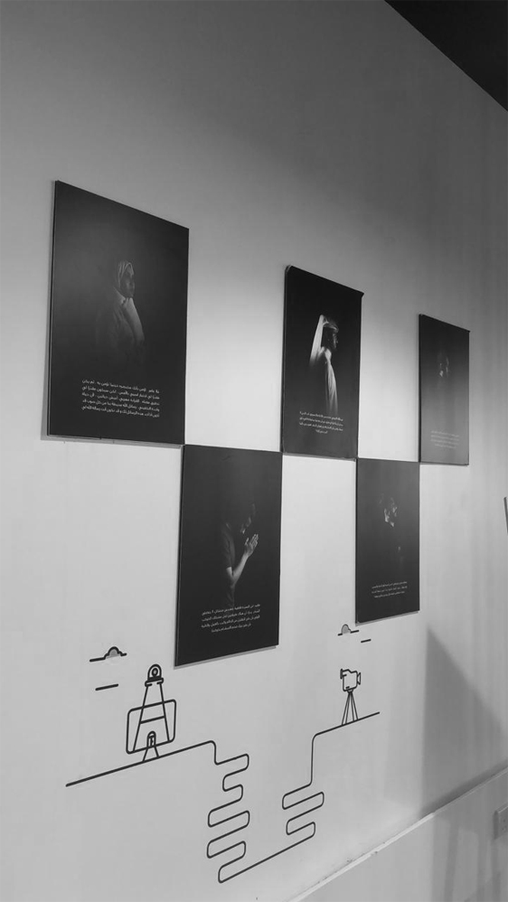
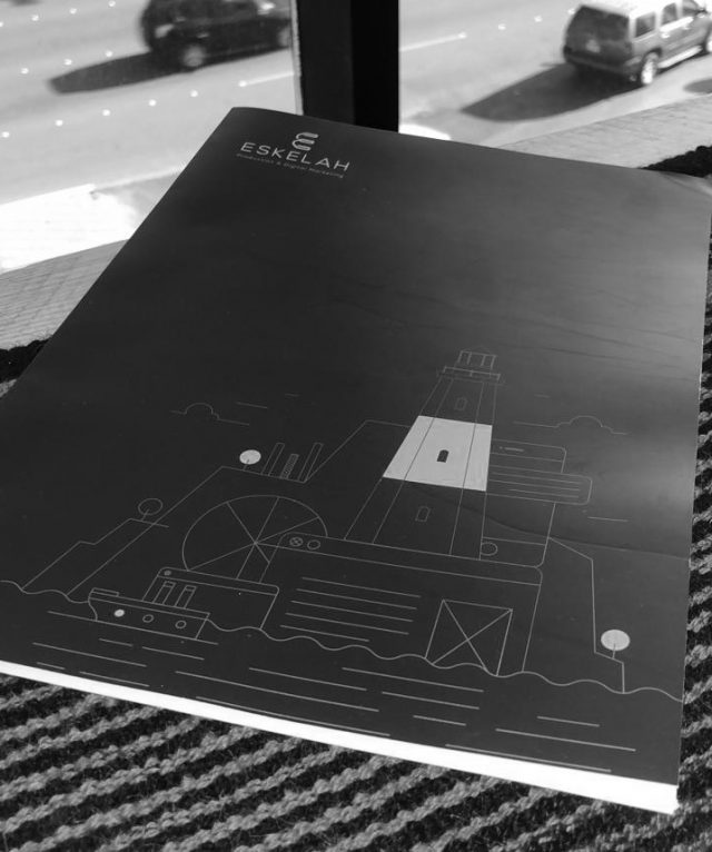
Since the logo was already established with a great concept, our mission was to find a way to highlight Eskelah’s educational side without failing to reflect their dynamic spirit as it is. Achieving what we hoped for; the Squad. decided to follow the outline illustrations innovative design style to make more room for us to go more dynamically with our art. We turned to the black and yellow colours; black to give their audience a sense of sophistication and trust, while the yellow is to reflect the creativity and energetic vibes that Eskelah team is known for.