
Dolato, A Taste of Italian Tradition
Industry Food
What We Did Brand Strategy, Visual Brand Identity, Wordmark, Packaging Design
Background
Dolato, a prominent gelato maker in Egypt, sought to solidify its position in the market by establishing a strong and distinctive brand identity. Recognizing the need to differentiate themselves from competitors and effectively communicate their commitment to high-quality, authentic Italian gelato, Dolato approached Squad with the challenge of creating a brand that resonated with both the heritage of Italian gelato-making and the preferences of modern Egyptian consumers.







Abdullah Al Turky Eskelah – CEO
“We are extremely thrilled with our partnership with Squad., enriching the visual content in the Saudi market. Squad. Is a professional team that adapted amazingly with the local market.”
Project Journey
Inspired by the rich history of Italian gelato, particularly the 16th-century innovations of Bernardo Buontalenti, the project team embarked on a journey to create a brand identity that seamlessly blended tradition with contemporary aesthetics. This involved extensive research into Italian gelato culture, from historical archives to modern-day gelaterias.
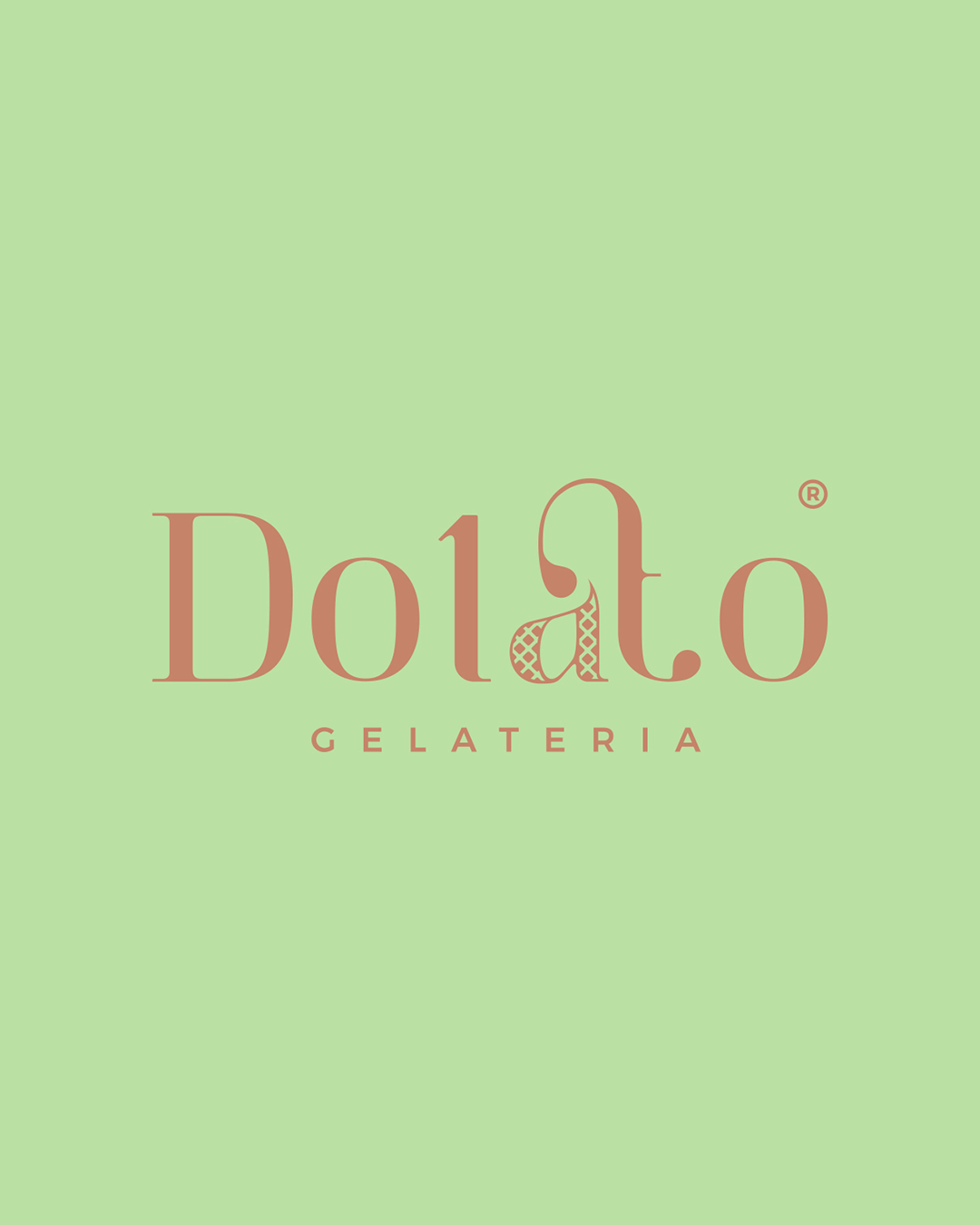
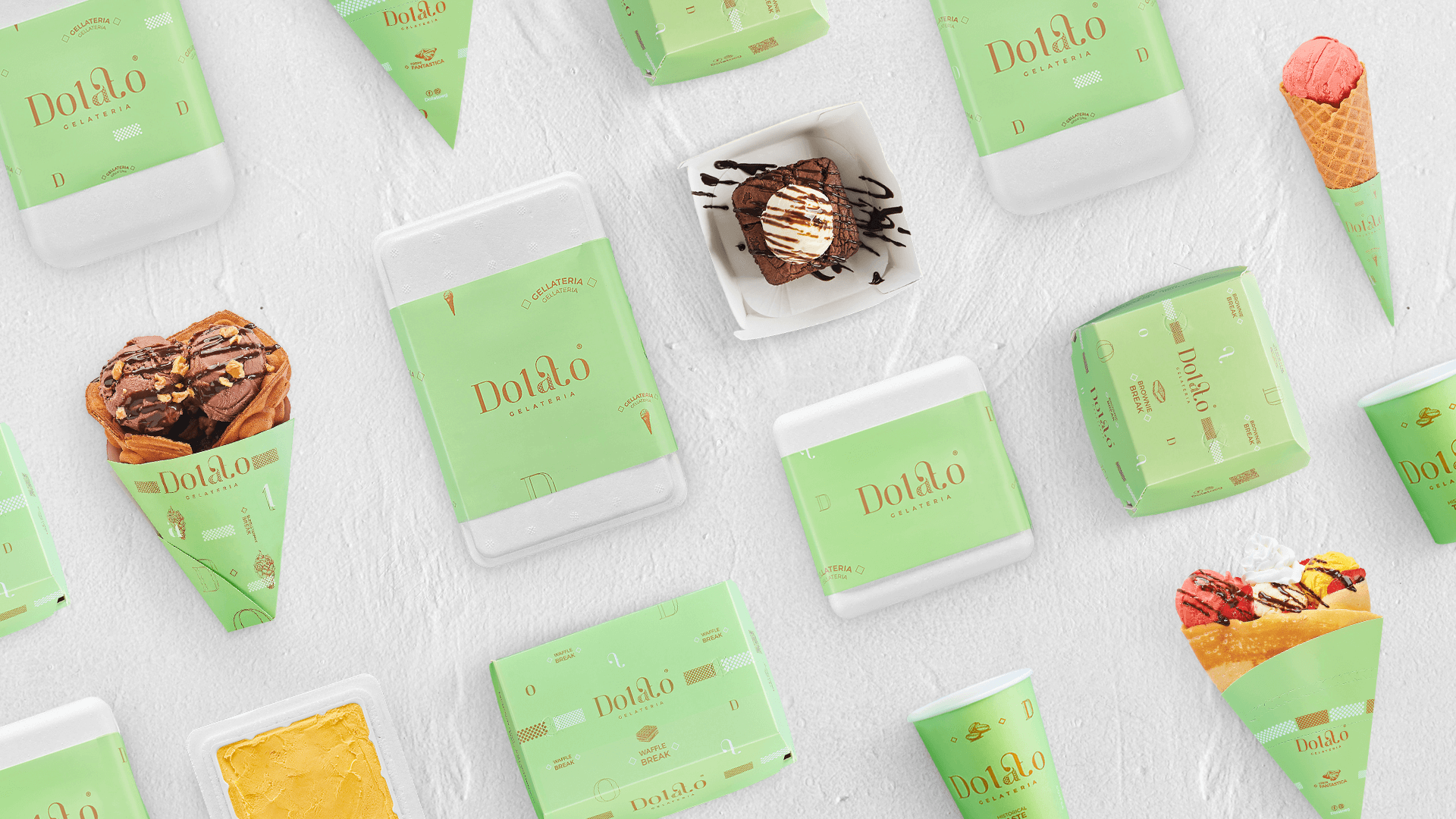
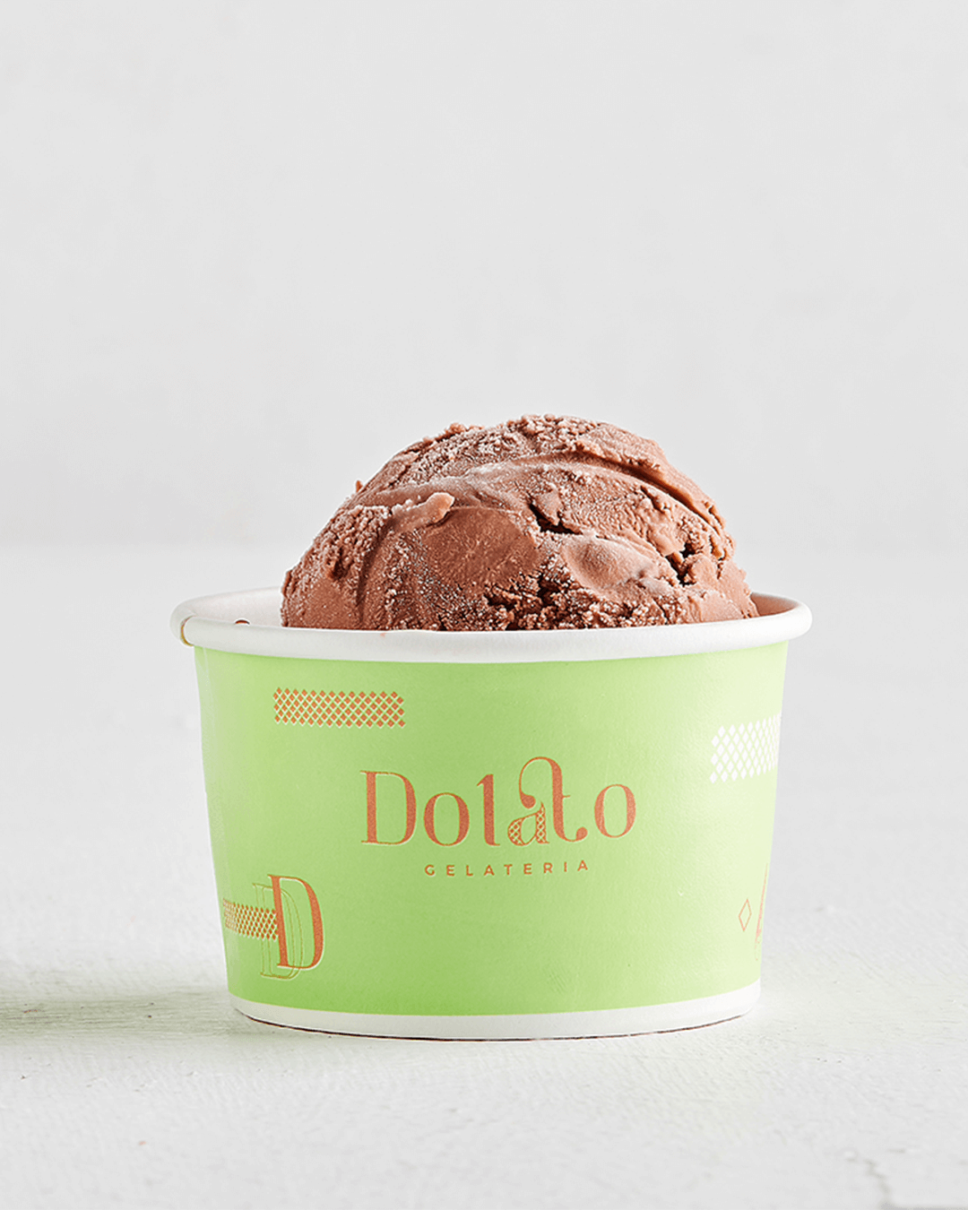
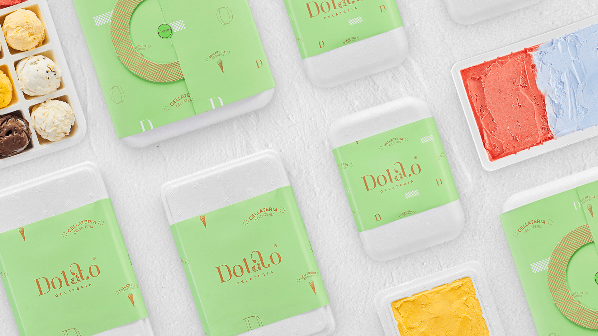
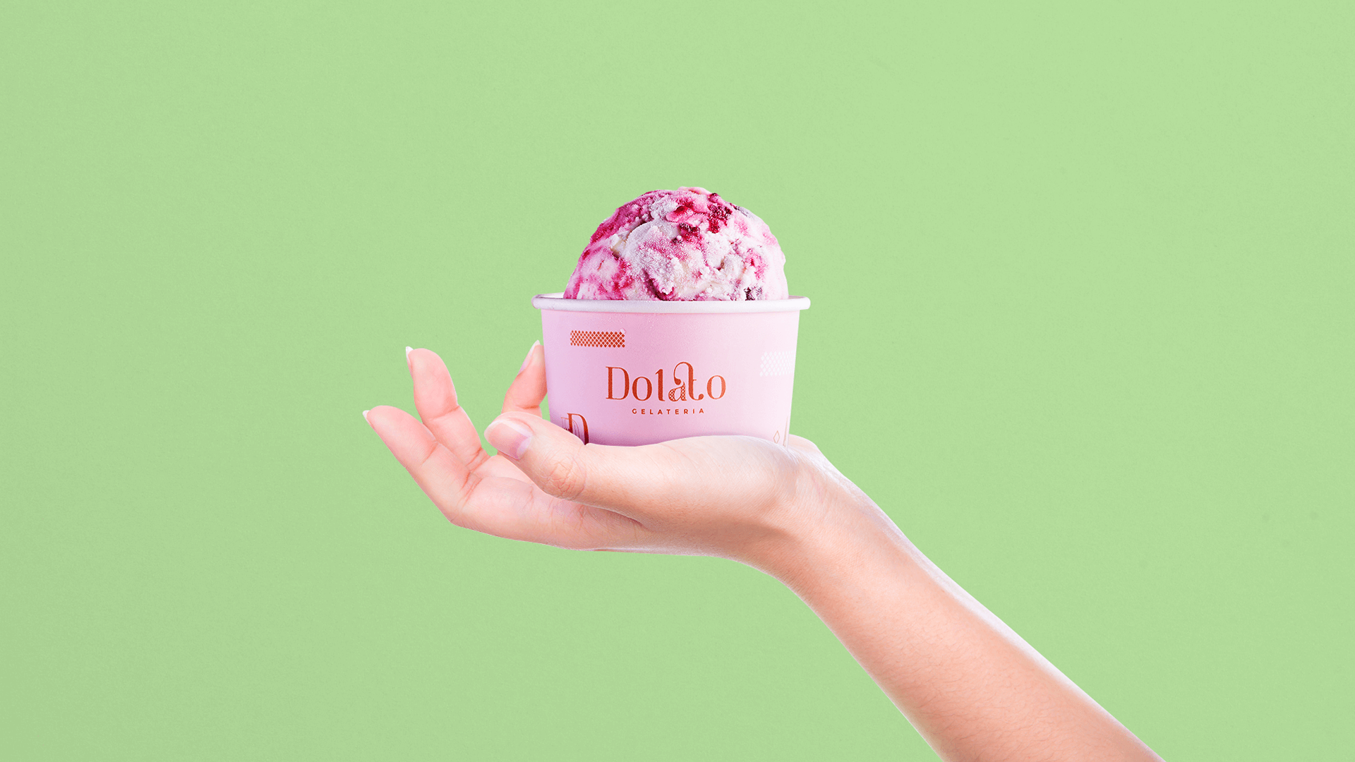
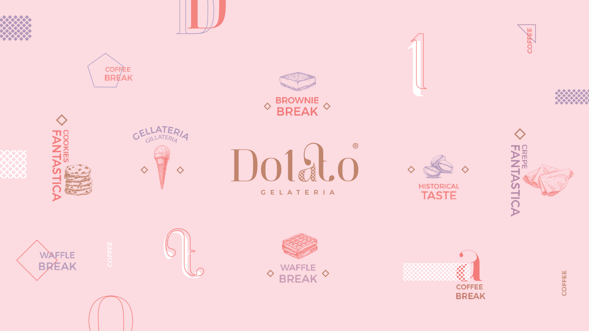
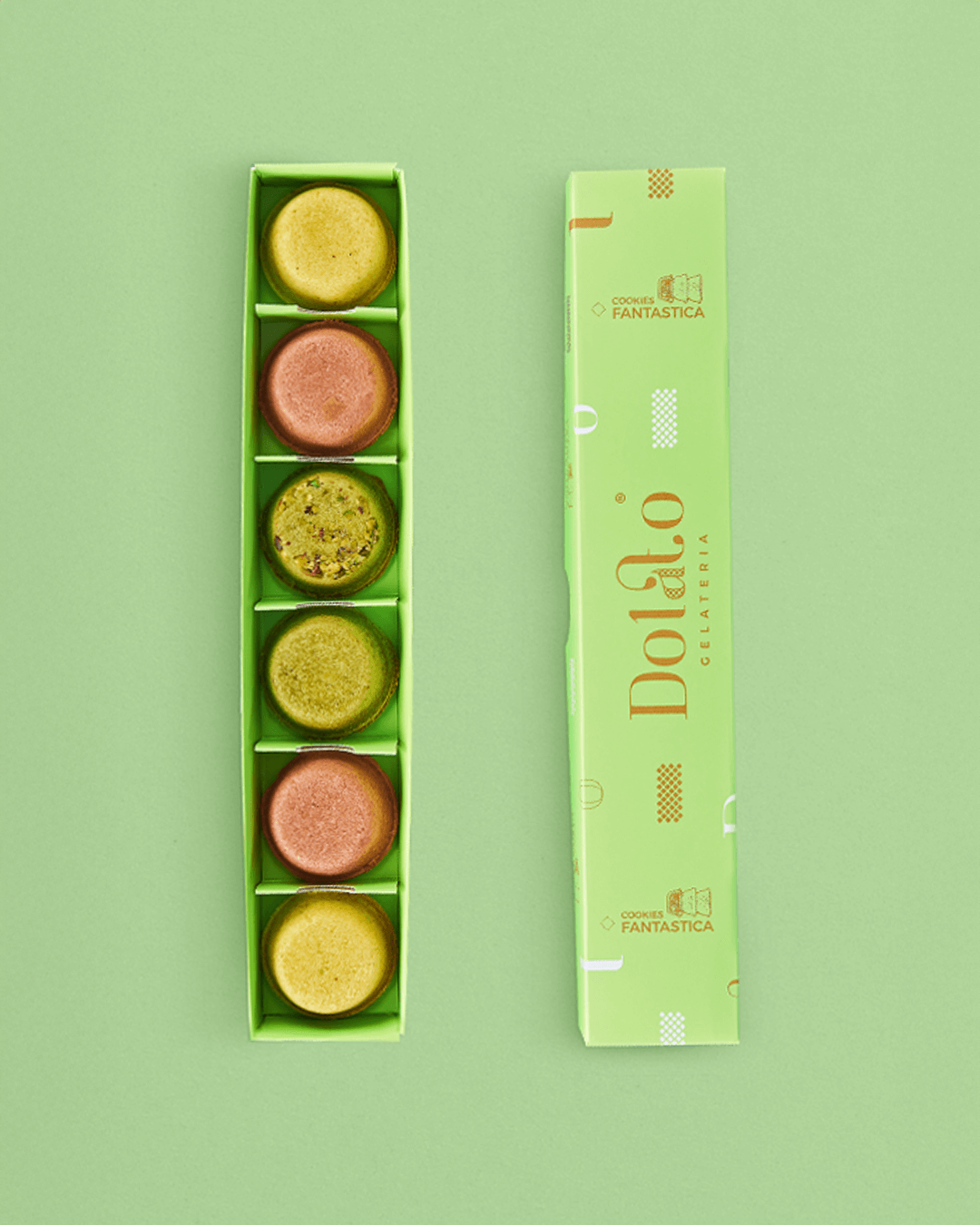
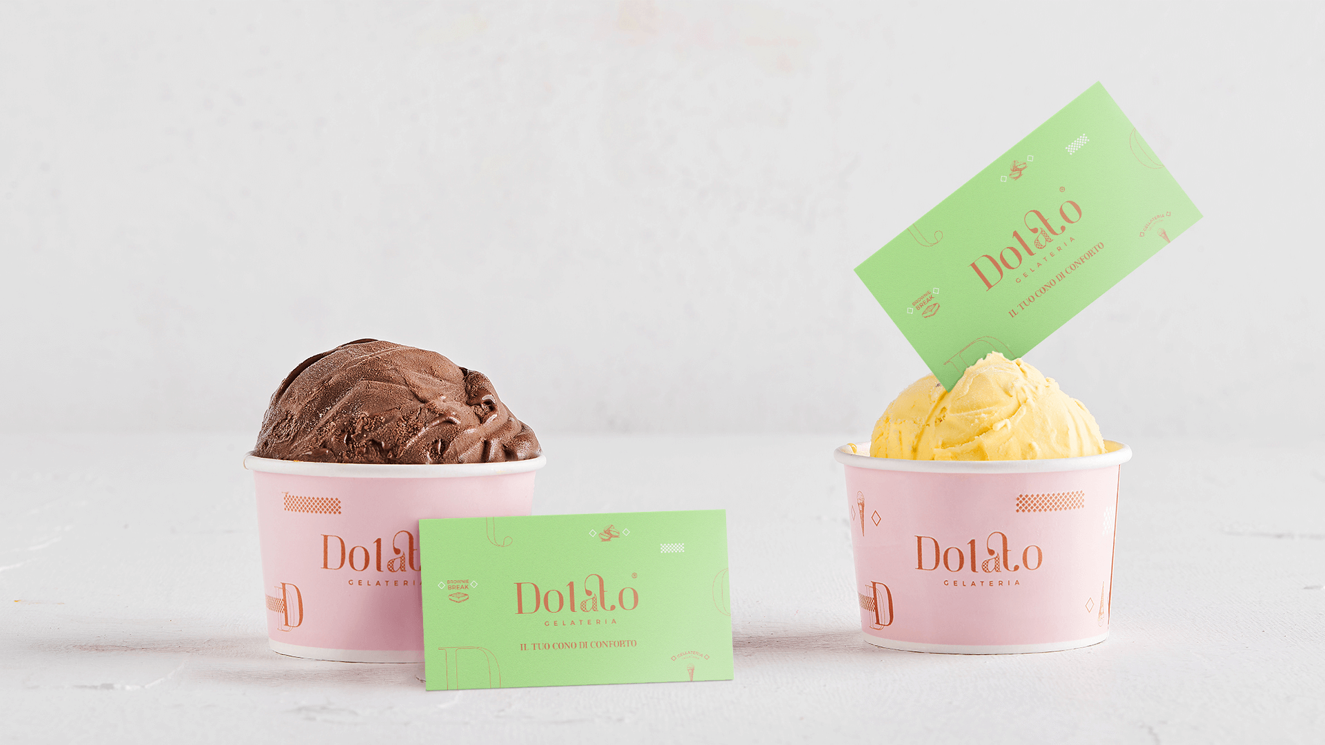
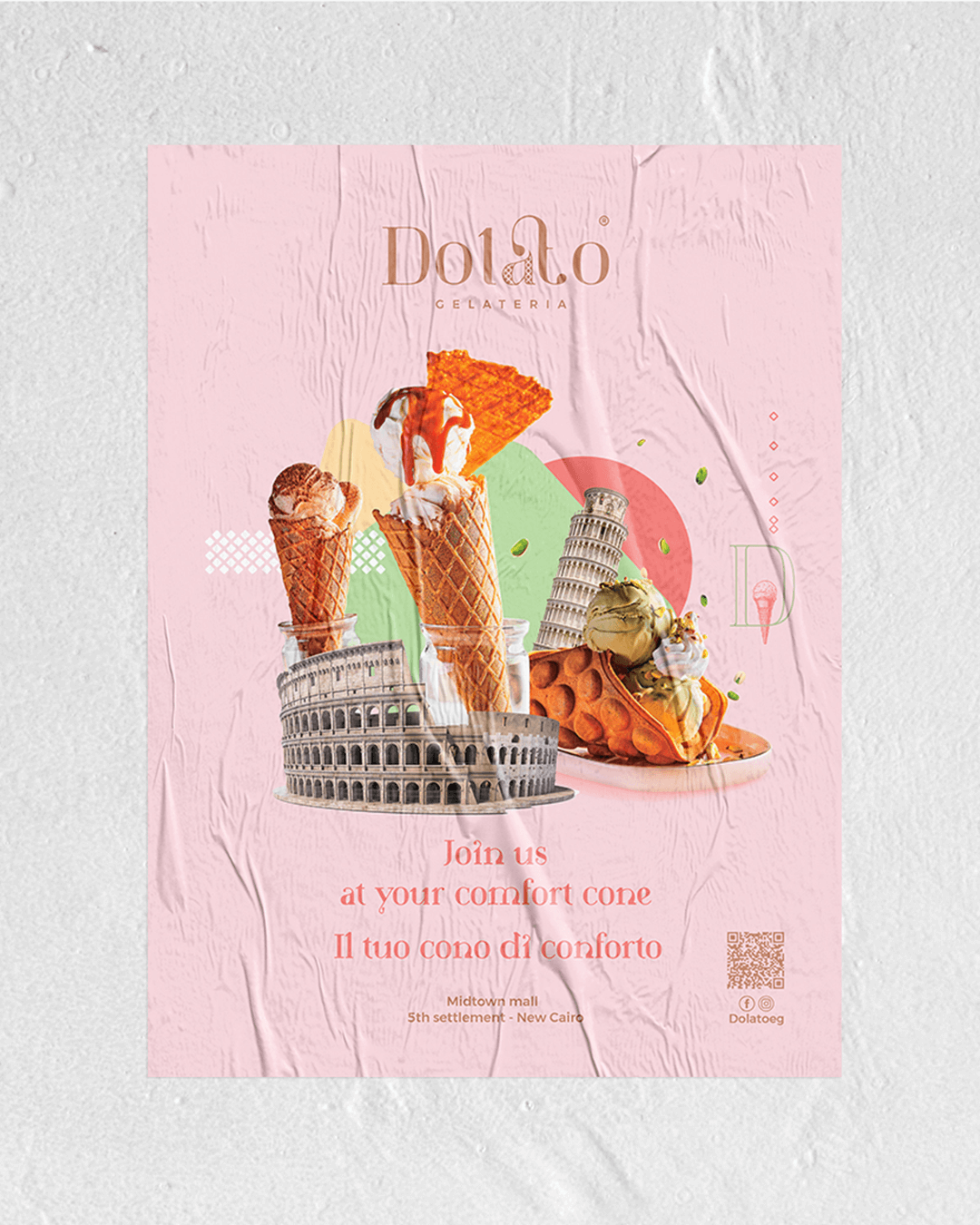
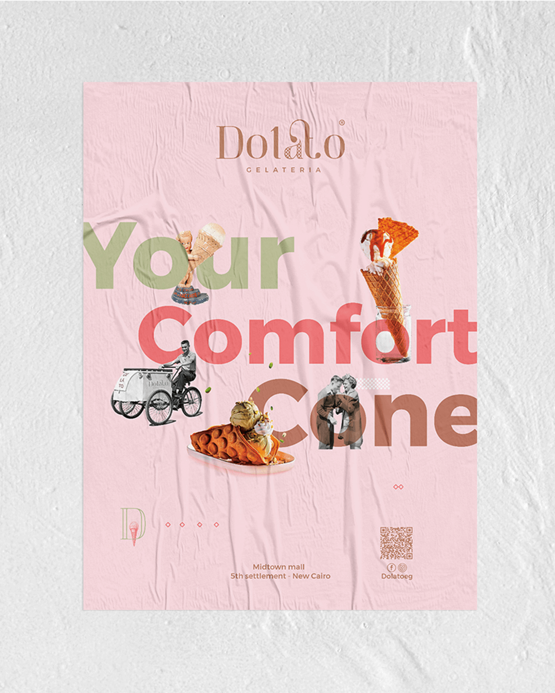
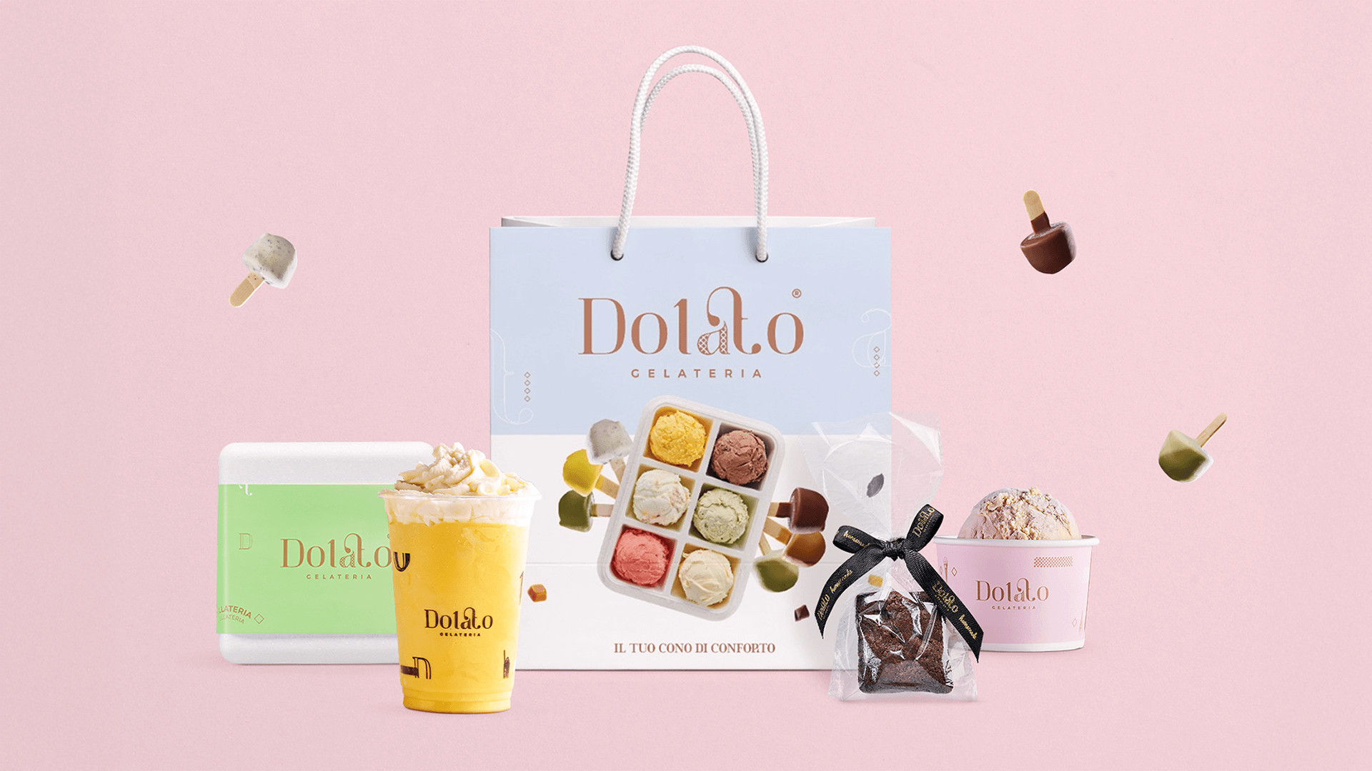
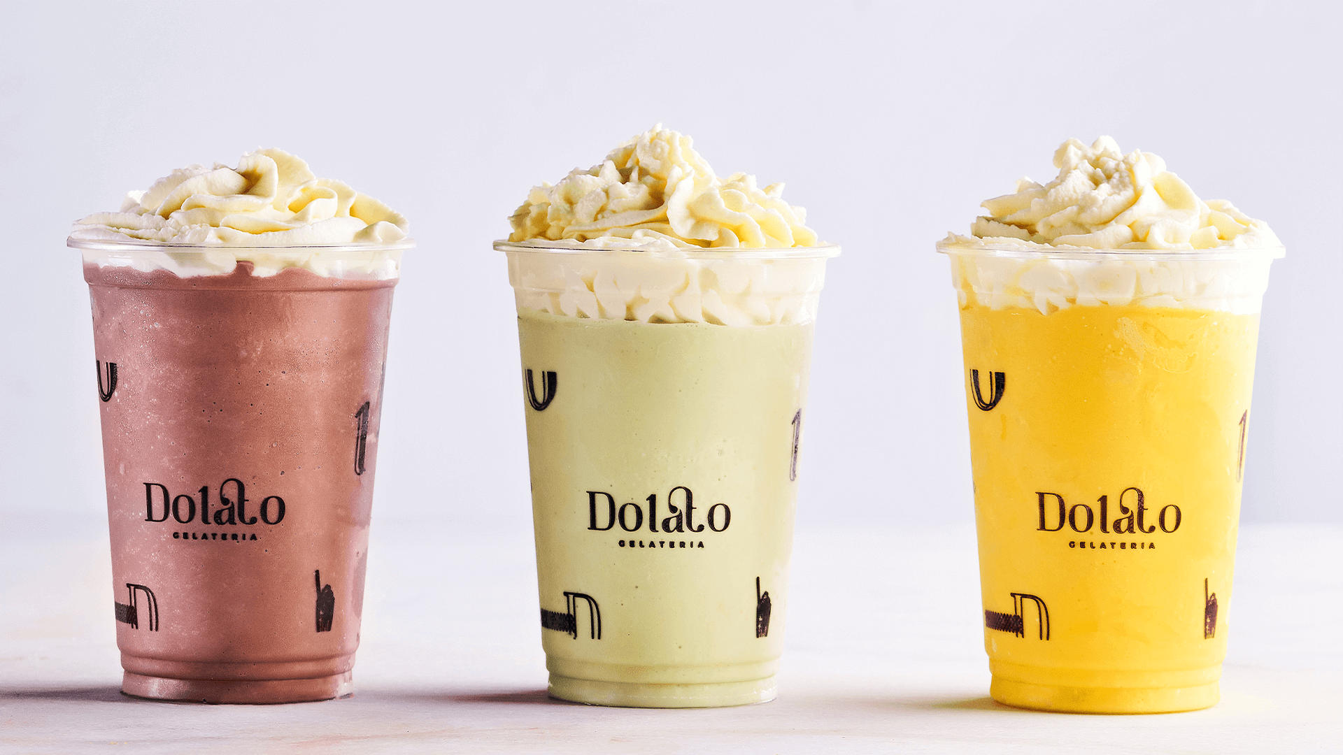
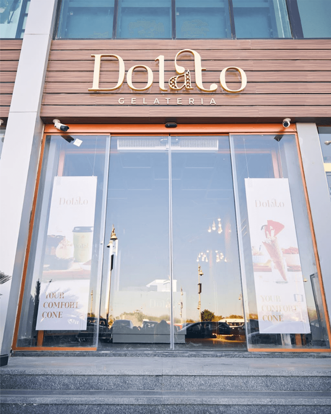
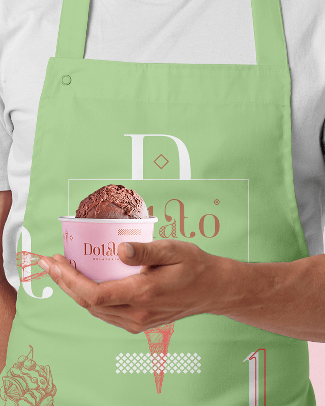
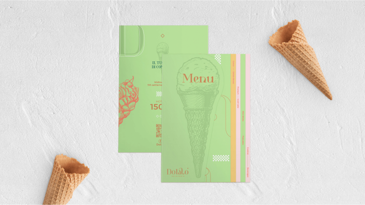
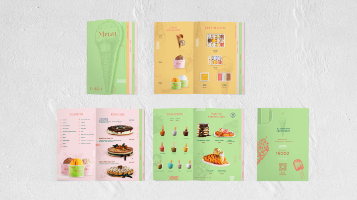
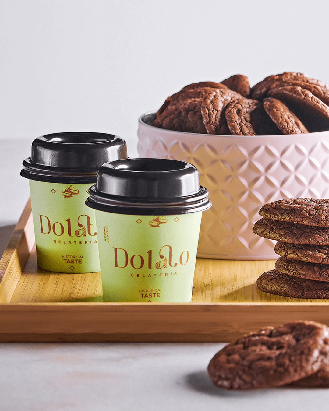
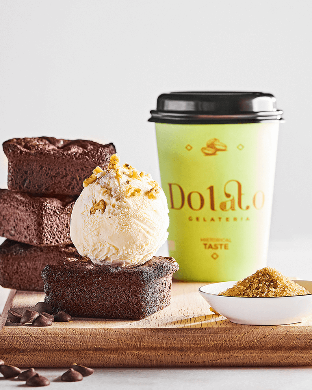
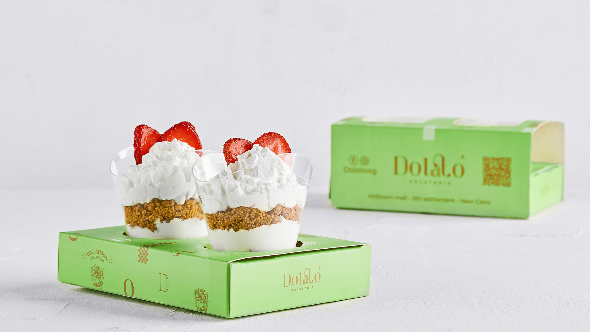
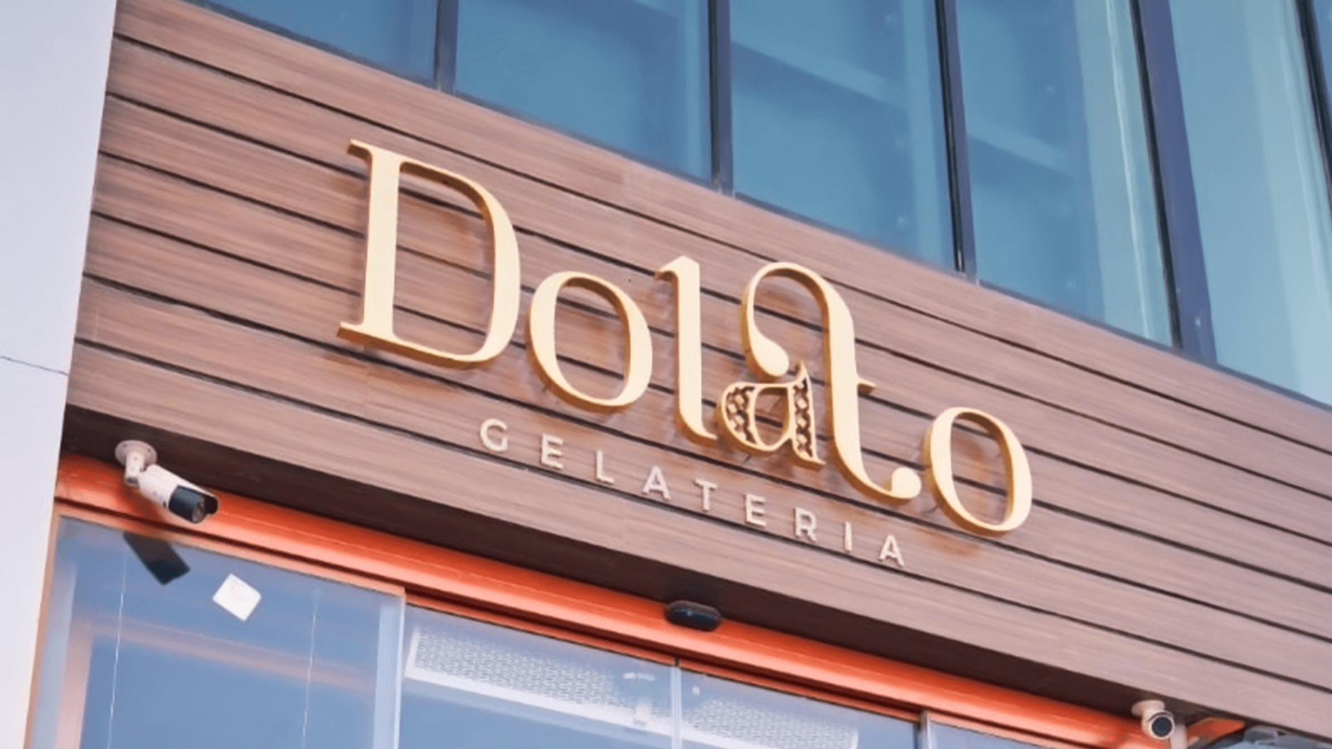
The team then translated this research into a unique visual language, proposing a calligraphic logo inspired by the elegant script found on old Italian gelateria signs. This logo, combined with a carefully curated palette of pale and unsaturated colors that reflected the natural hues of Dolato’s premium gelato, formed the foundation of the brand identity.
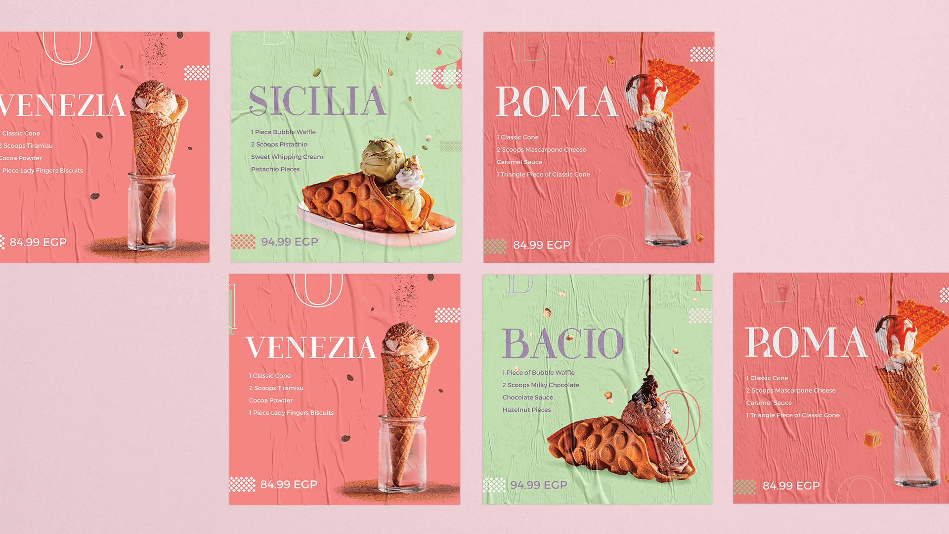
To further enhance the brand’s visual appeal, the team incorporated classic inking style illustrations, adding a touch of artistic flair and emphasizing the handcrafted nature of Dolato’s gelato. The design process involved meticulous exploration of various typographic styles to create a logo that was both distinctive and memorable.
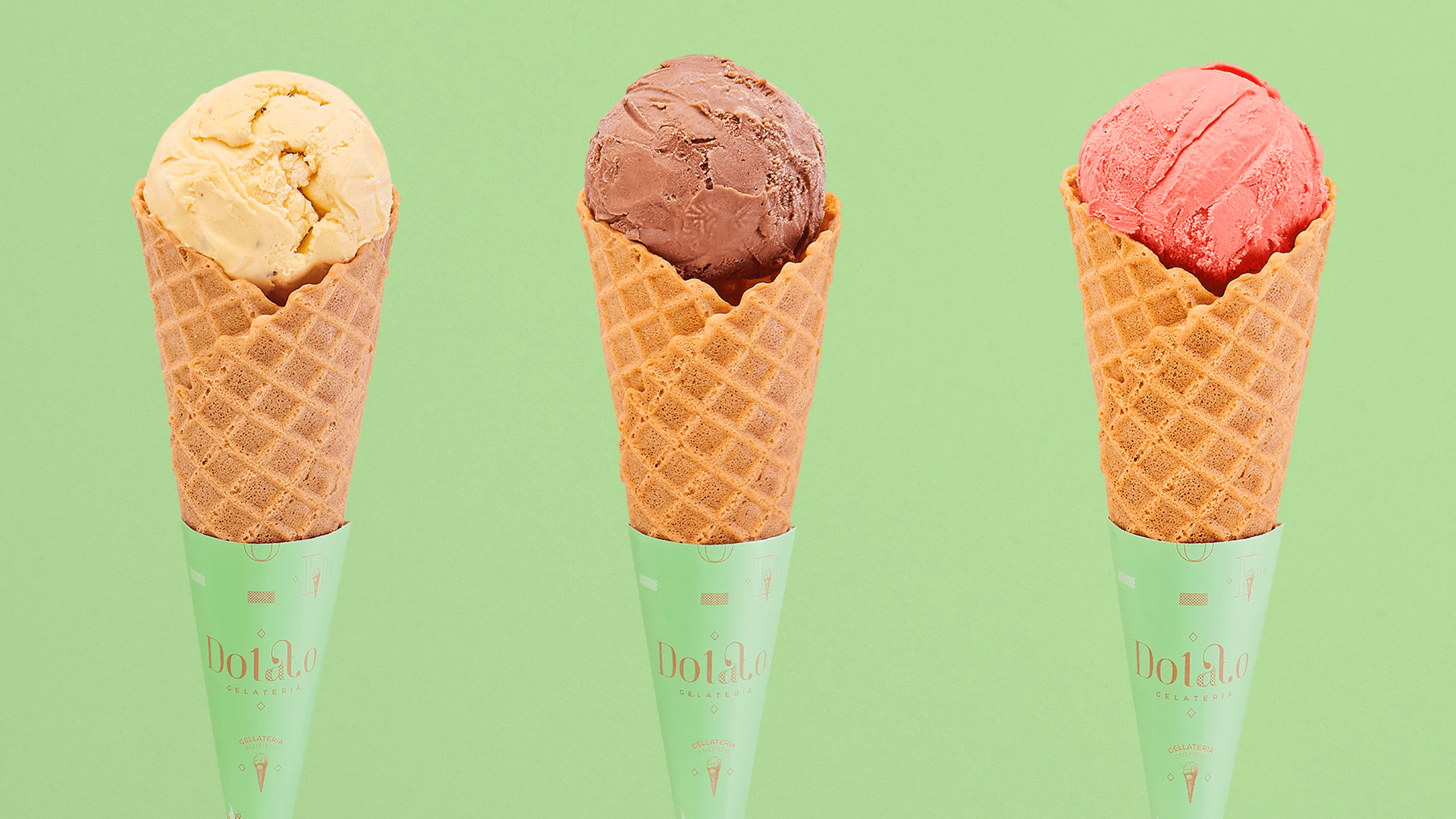
The team meticulously selected a color palette that not only reflected the natural ingredients of Dolato’s gelato but also conveyed a sense of sophistication and refinement. This approach ensured that the brand identity was visually appealing and effectively communicated the premium quality of Dolato’s products.