Client
KIT
Date
2020
ROLE
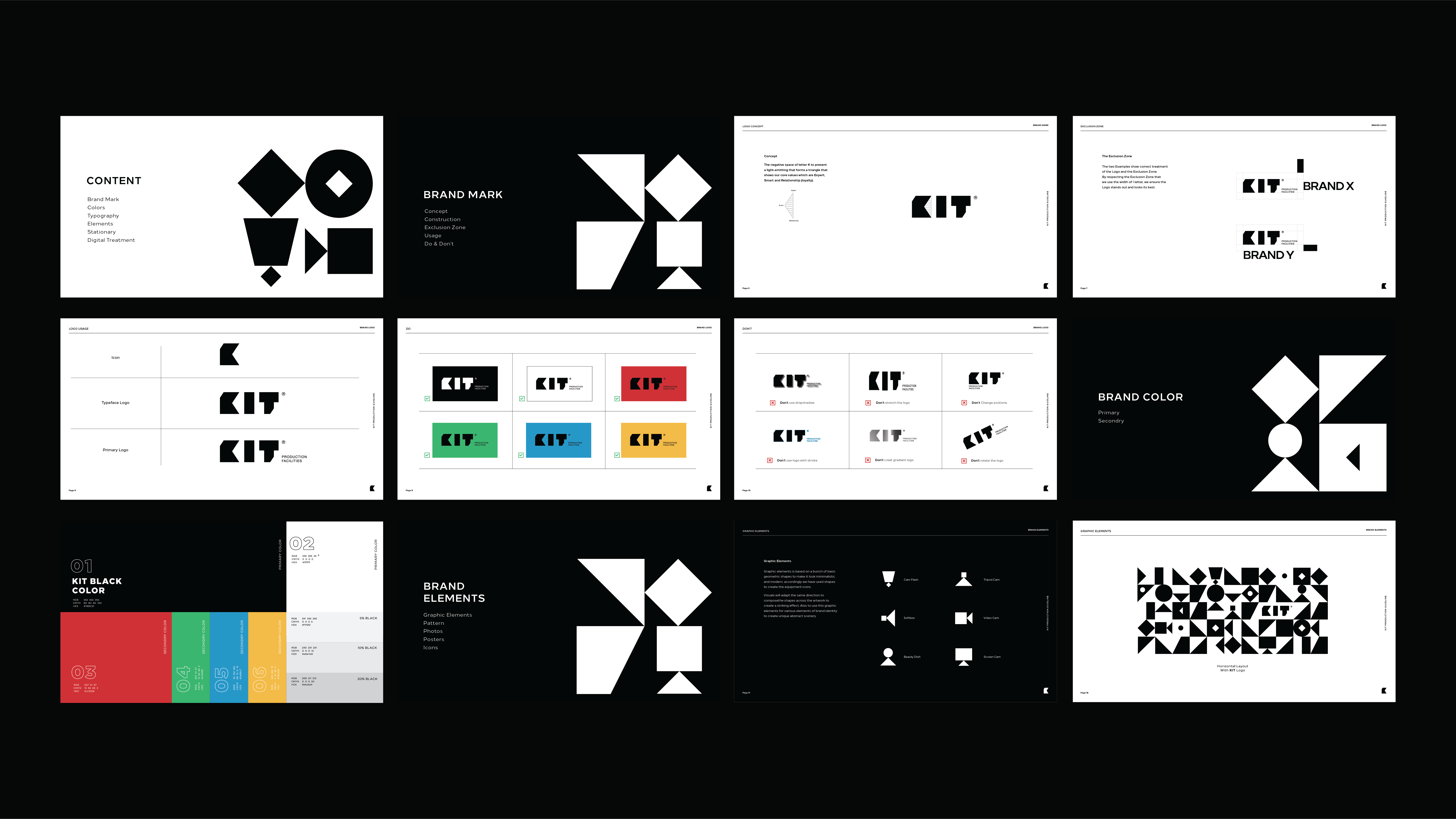
Logo Design, Visual Brand Identity, Brand Guideline and Art Direction
Abstract
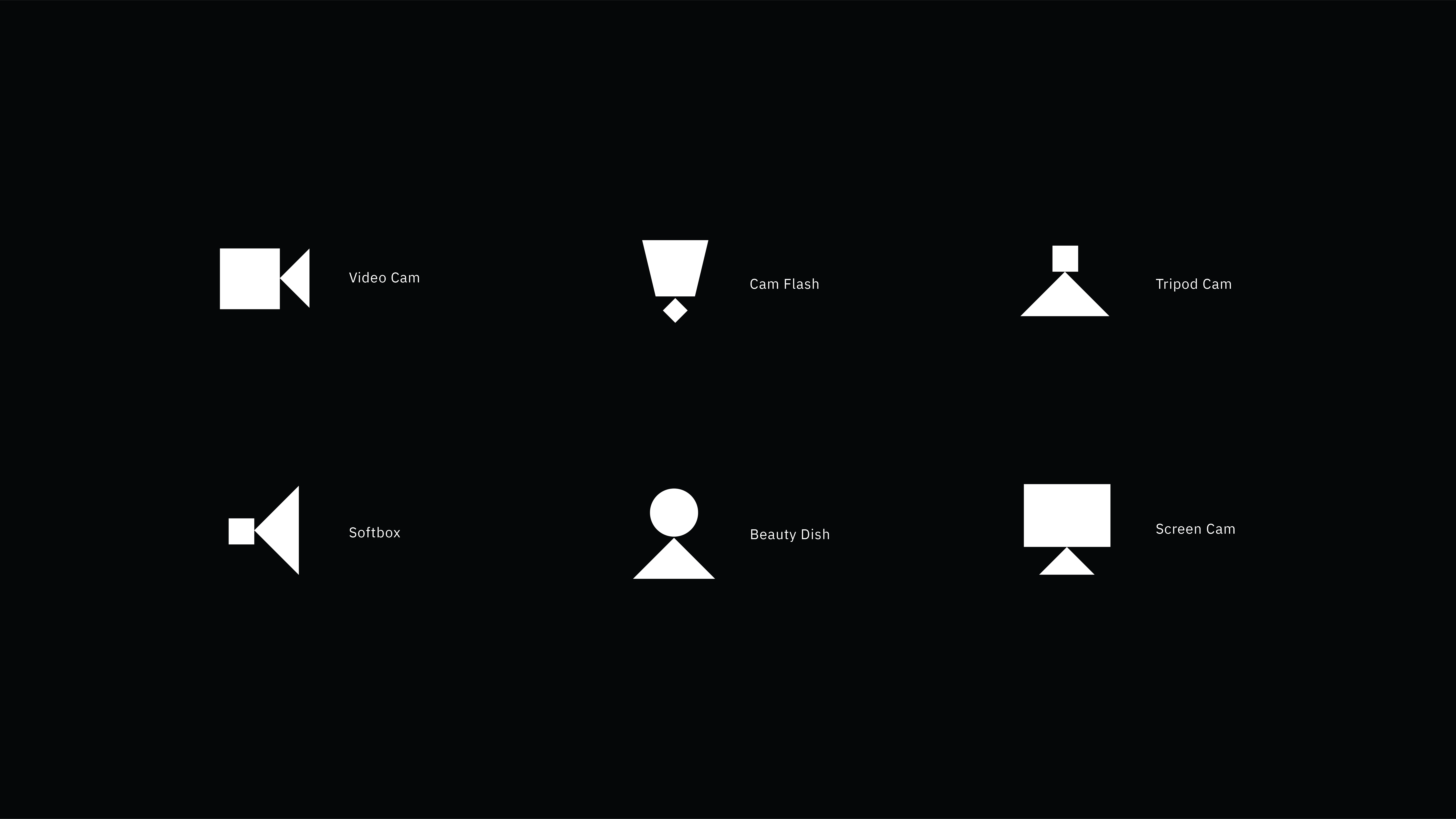
Inspired by the production equipment’s silhouette, designs and colors. Our prideful work with KIT production was a remarkable adventure, a distinctive journey and a unique experience for Squad Creative. The designing style represents boldness, minimalism, versatility and creativity enhancement. KIT production logo features the company name being manipulated by geometric shapes, with a clever touch on the negative space of the K letter. As we designed the K letter to represent the light equipment where all graphic elements will be extracted from.
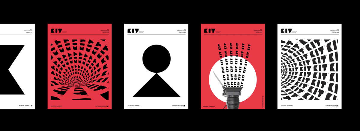
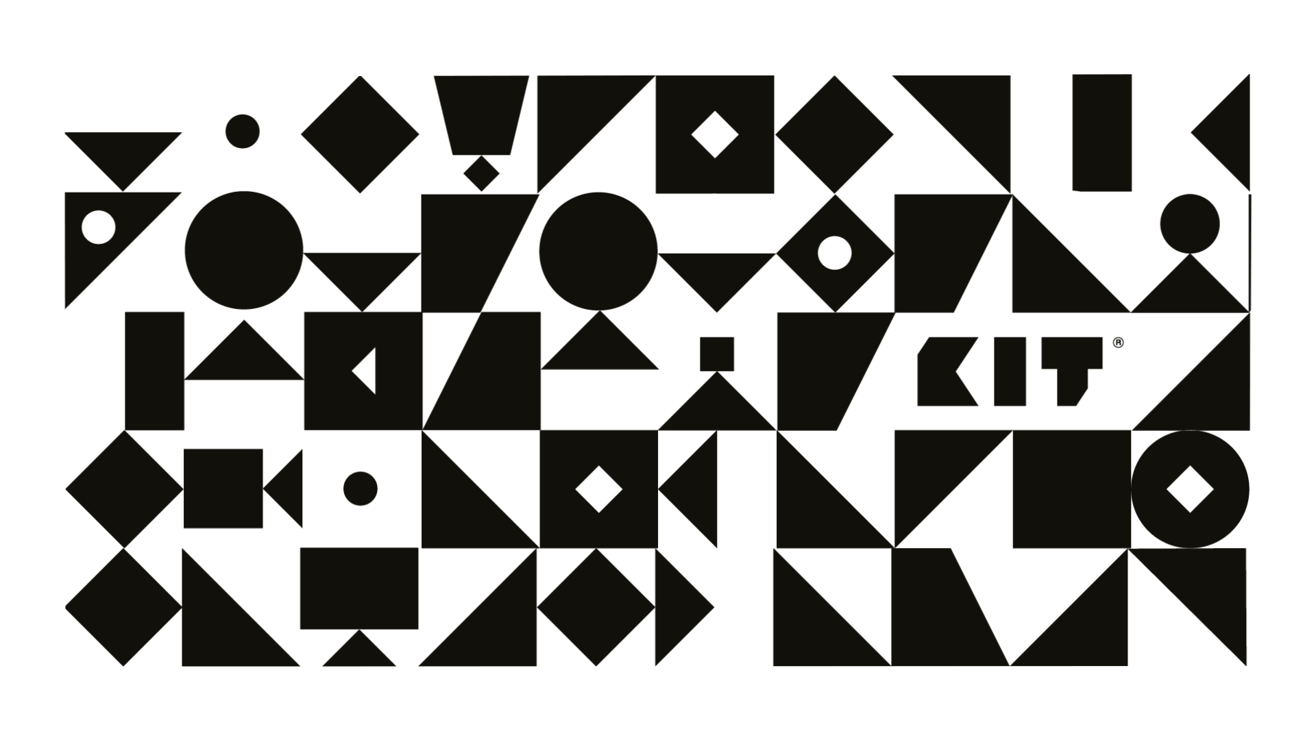
Graphic elements are based on a bunch of basic geometric shapes to make it look minimalistic and modern. Accordingly, we have used geometric shapes to create the equipment icons. Visuals will adapt the same art direction to compose the shapes across the artwork to create a striking effect. These graphic elements were also featured with the various components of brand identity such as icons, layout and pattern to create a unique abstract scenery.

We adopted the black and white colors as primary colors as they both create the maximum possible contrast of all colors, which all the secondary colors emerged from. The secondary colors we used were inspired by the colors used in designing small parts of production equipment.